Intent: decide — Yearbook page layouts determine whether a publication feels like a coherent keepsake or a loose collection of photos. Every section of a yearbook—from the opening theme spread to the senior portrait pages to the closing index—demands its own structural logic, yet all sections must read as part of the same unified book. That balance is what templates solve. A well-built template system doesn’t constrain editors; it frees them to focus on storytelling by resolving the recurring design decisions before anyone sits down to lay out a single spread.
This guide walks through the structural principles behind effective yearbook page layouts and provides template frameworks for every major section editors encounter throughout production. Whether you’re building a template system from scratch, troubleshooting a yearbook that looks inconsistent across sections, or training a new staff on layout fundamentals, these frameworks offer a reliable starting point that can be customized to match your school’s identity and publication goals.
Yearbook editors face a design challenge that professional publication designers spend careers mastering: creating a book that holds visual coherence across hundreds of pages, produced by a rotating team of students across months, covering subjects as different as chemistry class and varsity football. The solution professionals rely on is a template system—a defined set of structural rules that make consistent, attractive layouts achievable regardless of who’s at the design workstation. Understanding how to build and use yearbook page layouts systematically is the difference between a book your school will treasure and one that feels assembled rather than designed.

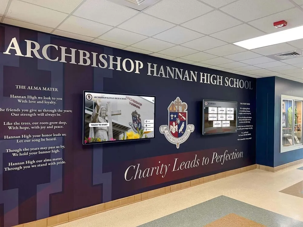
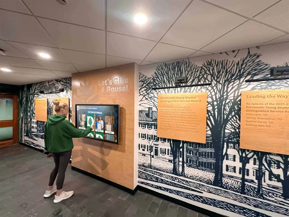
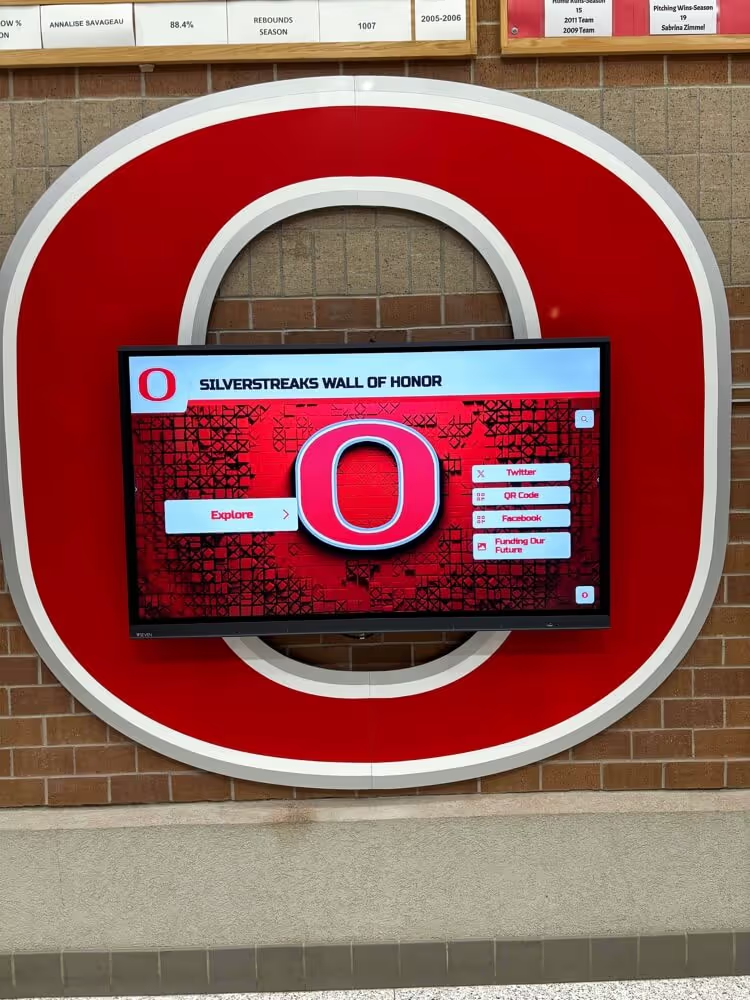
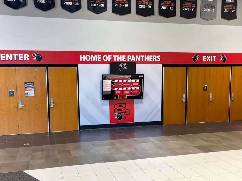
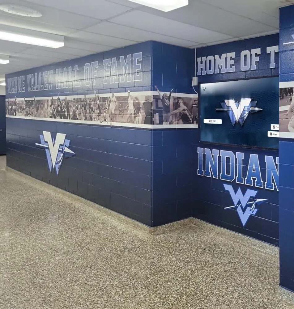
The same principles that make yearbook layouts work — visual hierarchy, consistent structure, and strategic emphasis — also guide effective school recognition displays throughout facilities
What Are Yearbook Page Layouts and Why Templates Matter
A yearbook page layout is the spatial arrangement of photographs, copy, headlines, captions, graphic elements, and white space within a defined page boundary. Every layout decision—where the dominant image sits, how many photos appear on a spread, how much copy accompanies a photo package, where headlines fall—communicates priority and guides readers through content.
Templates systematize these decisions. Instead of every editor reinventing the grid for every spread, a template establishes a repeatable structure that staff members can populate with section-specific content. Good templates define:
- The underlying grid: Column count, gutter width, margins, and baseline grid
- Image placement zones: Where dominant photos anchor spreads versus where supporting images sit
- Copy blocks: Headline, body text, and caption placement areas
- Graphic accents: Where theme-related design elements appear and at what scale
- White space allocation: Breathing room that prevents pages from feeling cluttered
The goal is not uniformity—yearbooks that look identical on every spread become monotonous. The goal is coherence: a shared visual language that makes the publication feel intentional even as individual spreads reflect the different personalities of each section.
Before worrying about aesthetics, yearbook editors also need to understand the legal side of sourcing images. Familiarizing your staff with yearbook photo copyright laws protects the publication and ensures every image your team includes is one you have the rights to use.
The Grid System: Foundation of Every Yearbook Layout
Before building section-specific templates, editors need to establish a master grid that governs the entire book. The grid is the invisible scaffolding underneath every spread.
Column Grids for Yearbook Pages
Most yearbook software works from a column-based grid. Common options:
Six-column grid: The most flexible choice for mixed-content sections. Six equal columns allow editors to create two-column photo blocks, three-column photo arrays, full-width dominant images, and narrow copy columns all within the same underlying structure. The six-column grid adapts to sports action photography, portrait grids, and text-heavy academic sections without requiring a different template for each.
Four-column grid: Works well for portrait-heavy sections like senior pages, clubs, or faculty spreads where photos are roughly equal in importance and consistent sizing matters most. Four columns create symmetrical arrangements that read as organized and formal—appropriate for sections emphasizing community membership.
Three-column grid: Simpler and more relaxed, appropriate for student life and candid-heavy sections where organic, flowing arrangements suit the content better than rigid symmetry.
Most professional yearbooks use a six-column master grid and adapt templates for individual sections by combining columns differently in each context.
Setting Margins and Gutters
Margins define the live area where content lives; gutters separate columns. Standard yearbook margins sit between 0.375 and 0.5 inches. Gutters between columns typically run 0.125 to 0.25 inches.
Bleeds—where images or backgrounds extend to the physical edge of the page—require content to extend at least 0.125 inches beyond the trim line. Full-bleed photography creates dramatic, immersive spreads. Understanding when to use bleeds versus when to maintain margins is one of the fundamental template decisions that shapes a yearbook’s visual personality.
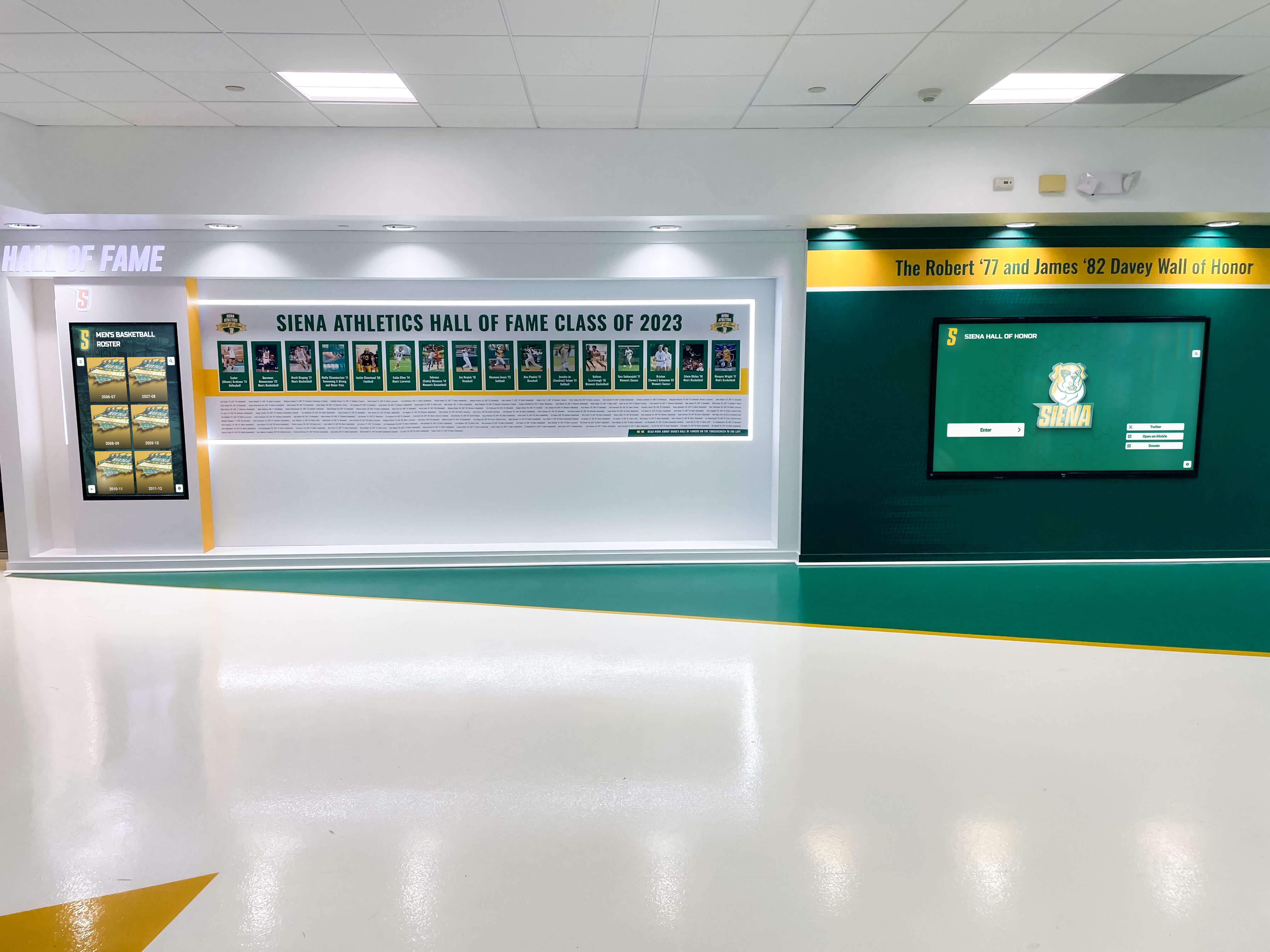
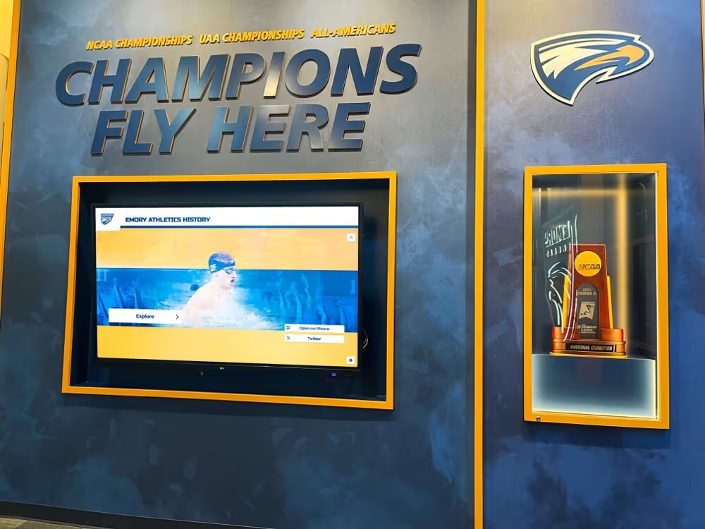
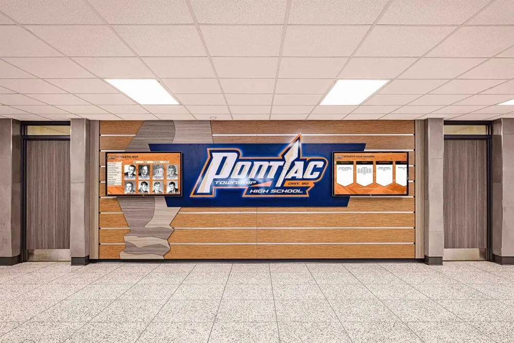
Organized recognition systems — whether in print yearbooks or physical display walls — use consistent structure to make individual achievements easy to find and visually compelling
Template Frameworks for Every Yearbook Section
1. Cover and Back Cover
The cover is the most visible design in your entire yearbook. It does not follow the interior grid — it operates by its own rules — but it still benefits from a template framework that defines non-negotiable elements.
Cover template essentials:
- School name and graduation year in a fixed position (typically upper third or lower third)
- Primary theme imagery occupying 60–75% of the cover face
- Yearbook title or tagline in a secondary position that doesn’t compete with the main visual
- School colors as the dominant palette
Cover design common mistakes: overcrowding the face with multiple competing elements, using a yearbook title font that’s too similar to the body text used inside, and selecting imagery that doesn’t photograph well when reduced to the thumbnail size shown in preview catalogs.
The back cover can mirror the front with a quieter treatment, or serve as a second creative canvas. Many effective back covers use a full-bleed photo from the year, a thematic graphic, or a student quote that bookends the publication emotionally.
2. Opening Theme Spread
The opening two-page spread introduces the yearbook’s theme and sets tonal expectations for the entire book. It’s the most designed spread in the publication—where the most creative freedom exists and where first impressions form.
Opening spread template framework:
- Dominant visual: One large image spanning at least 60% of the combined spread, establishing the visual mood
- Theme statement: 2–4 lines of large, display-weight typography that names or articulates the year’s theme
- Supporting images: 2–3 smaller images that preview the range of content inside
- Introductory copy: 150–250 words establishing context, tone, and the year’s defining character
- Theme color treatment: The spread’s color palette should establish the visual language used throughout the book
The opening spread benefits from full-bleed photography and generous white space. This is one context where editors should intentionally resist the urge to fit more content—the spread’s power comes from restraint and bold visual choices.
3. Student Life Section
Student life spreads cover everyday moments—spirit weeks, dances, lunch periods, hallway interactions, and the texture of the school day that doesn’t fit neatly into athletics or academics. These sections benefit from organic, dynamic templates that reflect the casual energy of the content.
Student life template options:
Mosaic template: 5–8 photos of varying sizes arranged in a mosaic pattern that fills the spread edge to edge. One dominant photo occupies 35–40% of the spread; supporting images fill the remaining space in irregular but balanced arrangements. Copy lives in a narrow column or is integrated as caption-only text alongside specific images.
Feature spread template: One dominant image takes 50–60% of the spread; a secondary image occupies 20%; remaining space holds copy block and captions. Best for events with strong photography that deserves extended storytelling (homecoming, prom, spirit week).
Grid template: Equal-sized photos in a uniform grid, 6–9 images per spread, with a headline block and unified caption column. Works well for recurring weekly or monthly events where variety of photography matters more than any single standout image.
Homecoming events, spirit weeks, and school dances generate the highest-volume photography in most yearbooks. Having a reliable mosaic template for these sections prevents editors from spending production hours reinventing the wheel each time a similar spread appears.
4. Academic Section Layouts
Academic sections often get the least creative attention and the most reader skip-overs — not because academics matter less, but because editors default to boring layouts. Strong academic templates change that.
Academic section template approaches:
Classroom profile spread: Anchor the spread with a compelling classroom action photo (not posed), include a brief teacher or course spotlight in a pull-quote box, surround with 3–4 supporting photos showing student engagement. The story of what happens inside a classroom becomes visual and specific.
Department overview template: Two-page spread using a three-column grid. Left page: large departmental or classroom photo with short editorial copy. Right page: 4–6 student or faculty quotes arranged in a typographic layout with small supporting images. This template works across science, arts, athletics, and humanities without modification.
Academic achievement feature: When covering awards, honor rolls, or academic competitions, use a portrait-grid template (4-column) for recognition photos paired with a headline and brief editorial summary. This structure mirrors the clarity and organization of the achievements themselves.
5. Sports and Athletics Section Templates
Sports photography is action-forward, emotionally high, and architecturally demanding — wide field shots, isolated athlete portraits, crowd images, and celebration moments all exist in the same section. Sports templates need to accommodate that range.
Sports spread template framework:
Single sport overview: Two pages per varsity sport minimum. Left page: one dominant action photo (full-height bleed), team record in bold typography, two headshots of senior captains. Right page: three supporting action photos (two-column arrangement), roster column, brief coach or captain quote, season summary copy (200–300 words).
Sports highlight feature: For championship seasons or breakthrough performances, expand to four pages. Pages 1–2 establish the season narrative with dominant photography and narrative copy. Pages 3–4 document the roster, individual standouts, and key game moments in a grid format.
Smaller sport or club sport spread: Single two-page spread using the mosaic template. Dominant photo plus 4–5 supporting images, team record, brief copy, and key players recognized by name in captions.
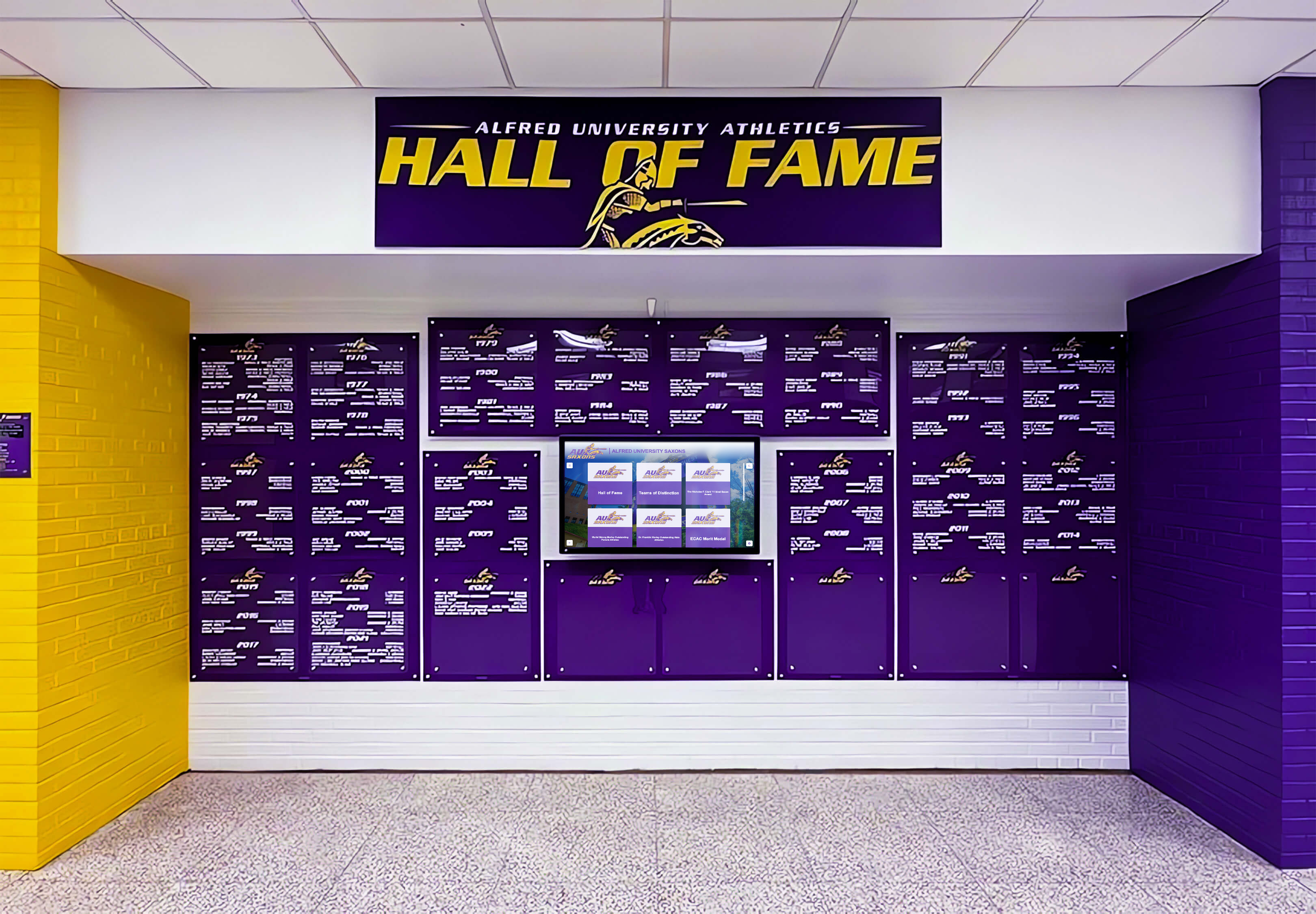
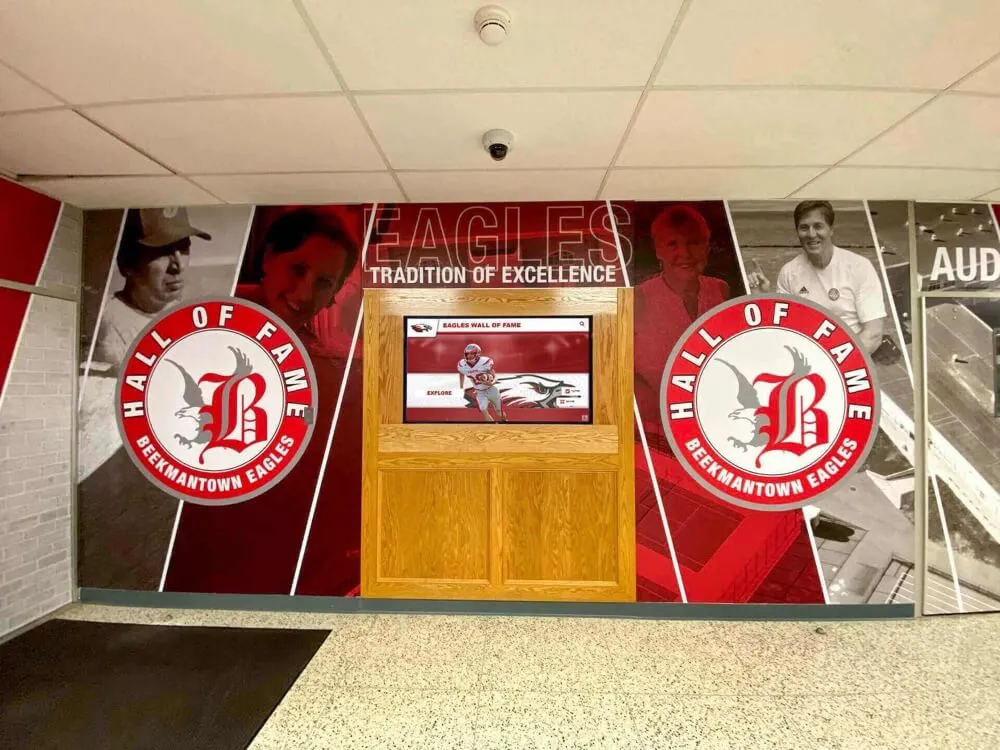
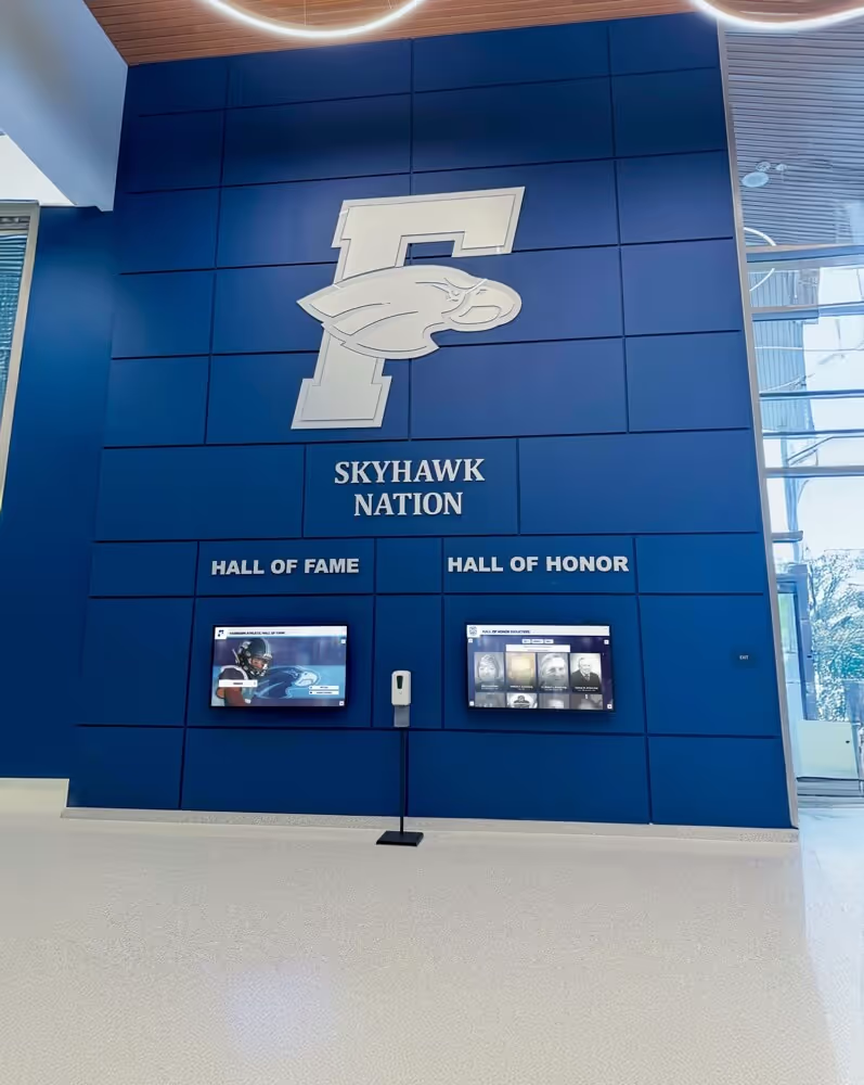
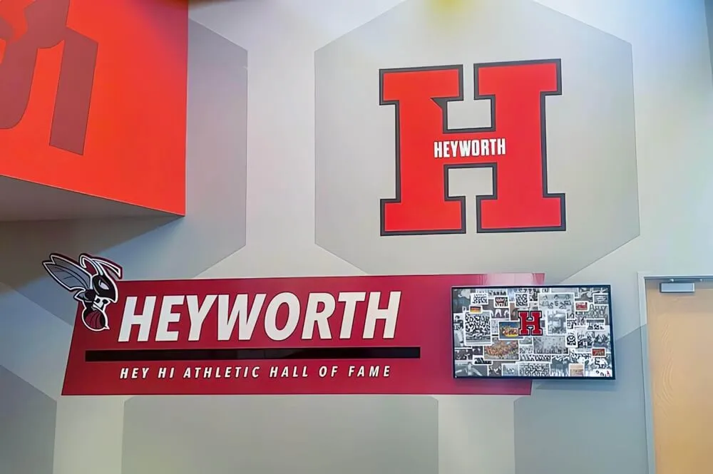
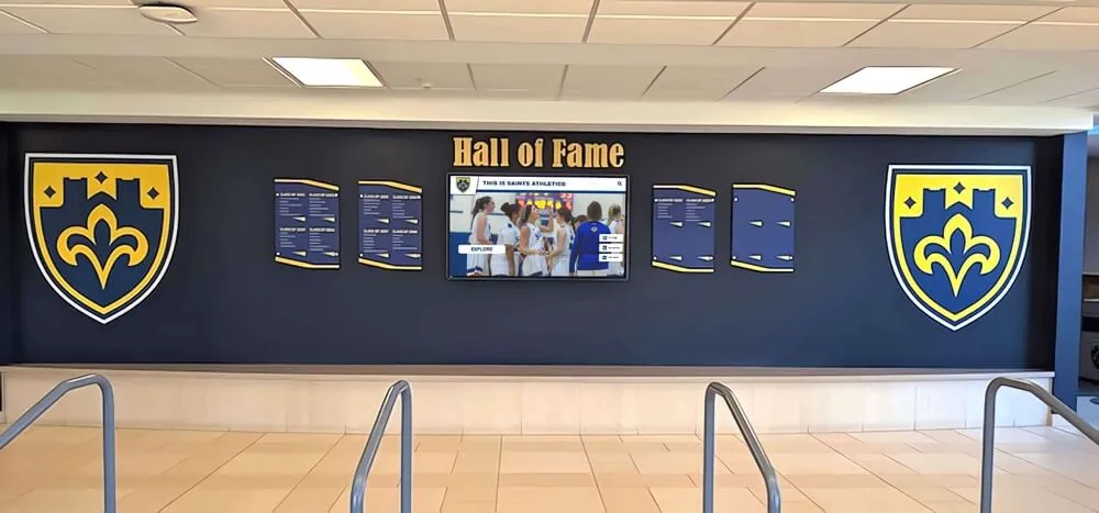
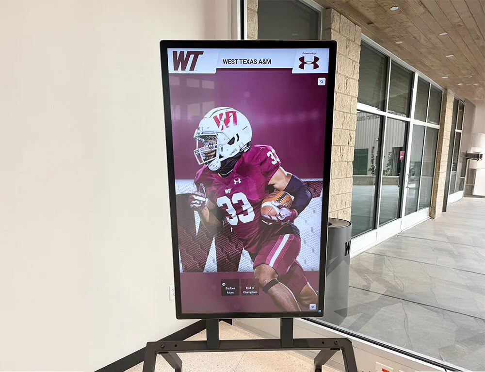
Athletics sections in yearbooks and physical recognition displays share the same design challenge: honoring a full roster of contributors while giving standout achievements appropriate visual prominence
For schools with strong athletic programs, understanding how peer institutions approach recognition program best practices can inform how much space to allocate in the yearbook and how to frame individual achievement within team context.
6. Clubs and Organizations
Clubs pages serve a different purpose than sports pages — they emphasize membership and belonging over performance. Students whose primary identity in school comes through clubs, arts, academic teams, or service organizations look to these pages for their yearbook presence.
Clubs and organizations template:
Organization directory spread: Four-column grid with one 4x6 group photo per organization, org name in bold headline, two-line description, and officer recognition. This efficient template lets 6–8 organizations share a spread without any single group dominating.
Club feature spread: When an organization had a standout year, expand to a full spread. Dominant action photo from an event or performance, officer profile column, membership photo in a grid, and copy covering the year’s accomplishments.
For performing arts and music programs, dedicated spreads honor the often-underrepresented students who power school culture without appearing in athletic box scores. Connecting yearbook coverage to broader arts and music recognition programs strengthens the visibility of these contributions both in print and beyond.
7. Senior Section Templates
The senior section carries the highest emotional weight of any yearbook section. It documents the graduating class in a format that families will examine closely and graduates will return to throughout their lives. Senior section templates must balance individuality with consistency.
Senior portrait page template:
The most common senior portrait format uses a four-up or six-up grid on a consistent background (school color or neutral). Each portrait follows identical sizing, framing, and position. Name typography sits below each portrait in a fixed style. This rigid consistency is intentional — it communicates equality and shared membership in the graduating class.
Senior quote and extras:
Many yearbooks include senior quotes below portraits, senior superlatives on separate spreads, or individual senior feature pages for student government officers, valedictorians, and other designated honorees. These supplemental templates maintain the senior section’s visual language while accommodating different content types.
Senior milestone spreads:
Spreads covering senior-specific events — prom, graduation ceremony, senior trip, senior pranks — can use the student life mosaic template adapted with senior-specific typography and more nostalgic color treatment. Understanding the full arc of senior traditions and milestone events helps editors identify which moments deserve dedicated spreads versus photo collections.
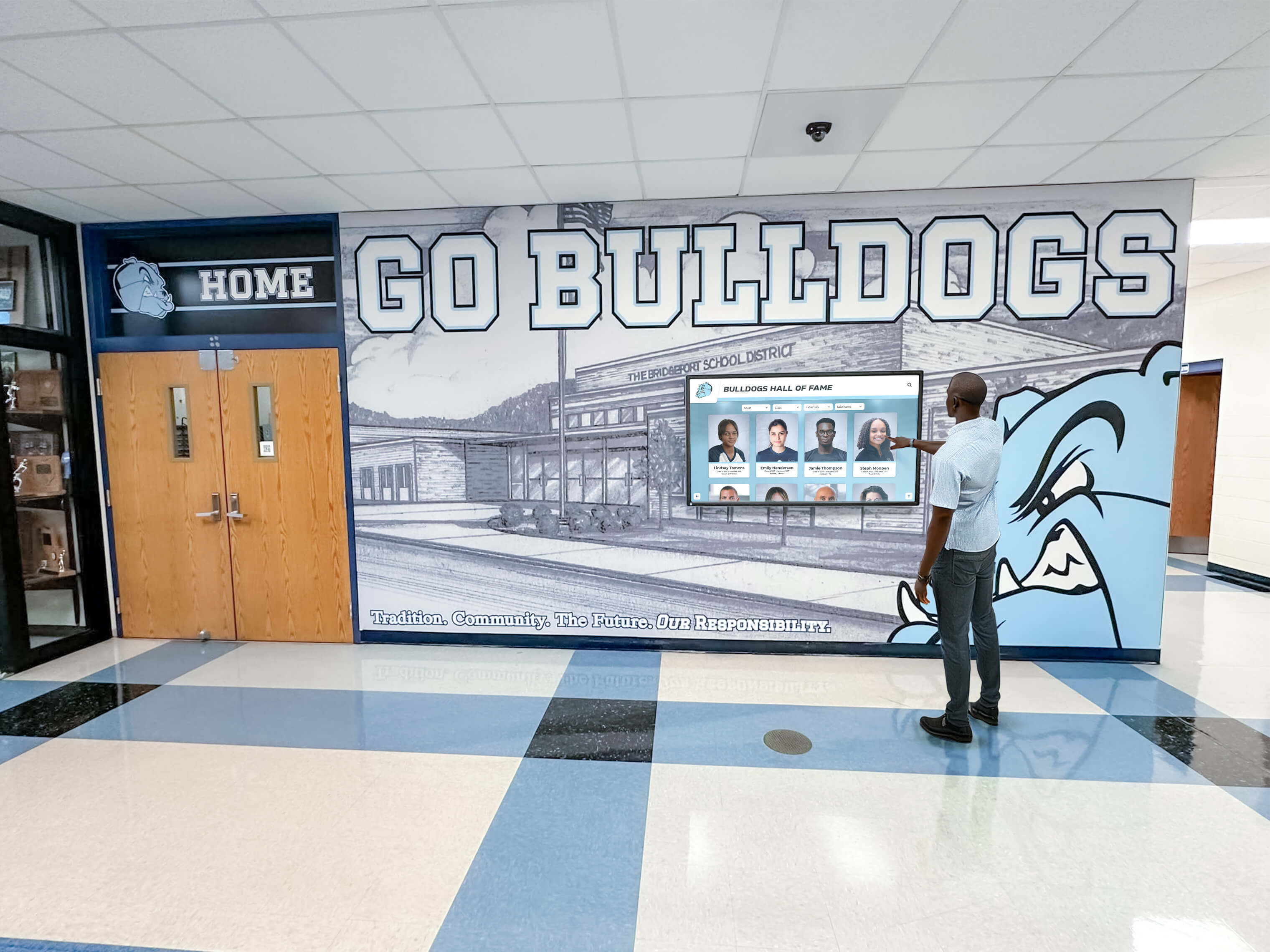
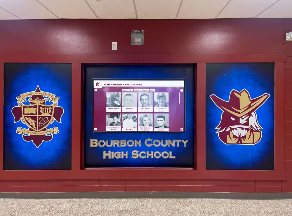
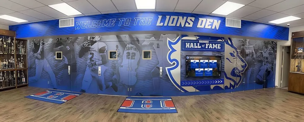
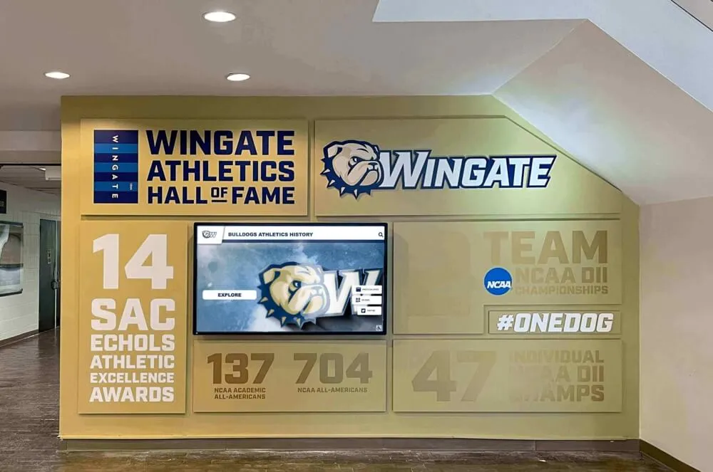
Senior sections in yearbooks — like digital hall of fame displays — create lasting records that graduates return to throughout their lives, making layout consistency and portrait quality critical investments
8. Closing Spread and Index
The closing spread mirrors the opening spread’s purpose: it provides emotional punctuation for the publication. Many effective closing spreads use a final reflective photo, a brief editorial note from the editor-in-chief, and a typographic element that calls back to the opening theme statement.
The index—often the most functionally important part of the yearbook for readers trying to locate specific people—benefits from the most utilitarian template in the book. Small, consistent typography, clear alphabetical organization, and page number references are the priorities. Reserve any design expression for the index section header page, leaving the index entries themselves clean and scannable.
Core Design Principles That Make Templates Work
Effective yearbook page layouts don’t just follow templates mechanically — they apply design principles that make templates succeed.
Visual Hierarchy
Every spread needs a clear hierarchy: one dominant element (usually the largest photo) that the eye lands on first, secondary elements that provide context and variety, and tertiary elements (captions, small supporting photos) that reward closer reading. When everything on a spread competes for equal attention, nothing stands out.
White Space as a Design Element
Empty space is not wasted space. Margins, breathing room between photos, and open areas within layouts guide the eye, prevent visual fatigue, and communicate that editors made deliberate choices. Spreads that fill every pixel with content look frantic. A well-placed white space column can make a photo feel more significant, not less.
Dominant Image Sizing
A spread without a clearly dominant image — one photo that is visibly larger and more visually prominent than all others — reads as indecisive. Editors sometimes fear making one photo “too big” and shortchanging the others. The opposite is true: a clear dominant image earns its prominence and makes every other element on the spread stronger by providing context and contrast.
Typographic Consistency
Headline fonts, caption fonts, body text fonts, and pull-quote treatments should remain consistent across all sections. Schools that establish a two or three-font system and apply it throughout produce yearbooks that look significantly more professional than those where fonts vary spread to spread based on individual editor preferences.
Maintaining Visual Consistency Across Sections
Section editors working in parallel — one team covering sports while another covers clubs while another handles academics — inevitably produce spreads that look like they came from different books unless a shared style system is in place.
Create a yearbook style guide documenting:
- Approved fonts and their specific uses (headline, subhead, caption, body, pull quote)
- Color palette with specific values (CMYK for print, not just approximate descriptions)
- Photo treatment standards (do photos get borders? drop shadows? no decoration?)
- Caption format (italics? indent? character count limits?)
- Section opener page treatment standards
A one-page visual style guide shared with all section editors at the beginning of production prevents the inconsistency that requires late-production remediation when pages are assembled together for the first time.
Physical recognition displays in school hallways face the same challenge — school display cases and hallway installations that lack consistent visual language look cluttered despite containing valuable content. The principle is the same whether you’re designing print pages or physical spaces: coherent visual standards make everything look more intentional.
When to Break the Template
Templates exist to be broken strategically. A feature spread for the state championship, a memorial tribute to a beloved faculty member, a photo essay from a significant community event — these moments deserve exceptional layouts that stand apart from section templates.
The rule: break the template with intention, not inconsistency. An unconventional layout on a feature spread reads as a deliberate creative choice when the surrounding spreads follow consistent templates. An unconventional layout on a routine section spread reads as a mistake.
Identify before production which moments in the school year are likely candidates for template-breaking feature treatment. Build those spreads with extra planning time and creative resources.
Extending Yearbook Layouts Into the Digital World
Print yearbooks document a specific year — they are by definition fixed and finite. But the content yearbooks contain: the portraits, the achievements, the group photos, the recognition of student accomplishments — has enduring value that extends well beyond the print run.
Schools increasingly recognize that yearbook content should have a permanent digital home alongside the physical book. Digitizing old yearbooks and creating accessible archives transforms static annual publications into living institutional histories that alumni can access and explore for decades.
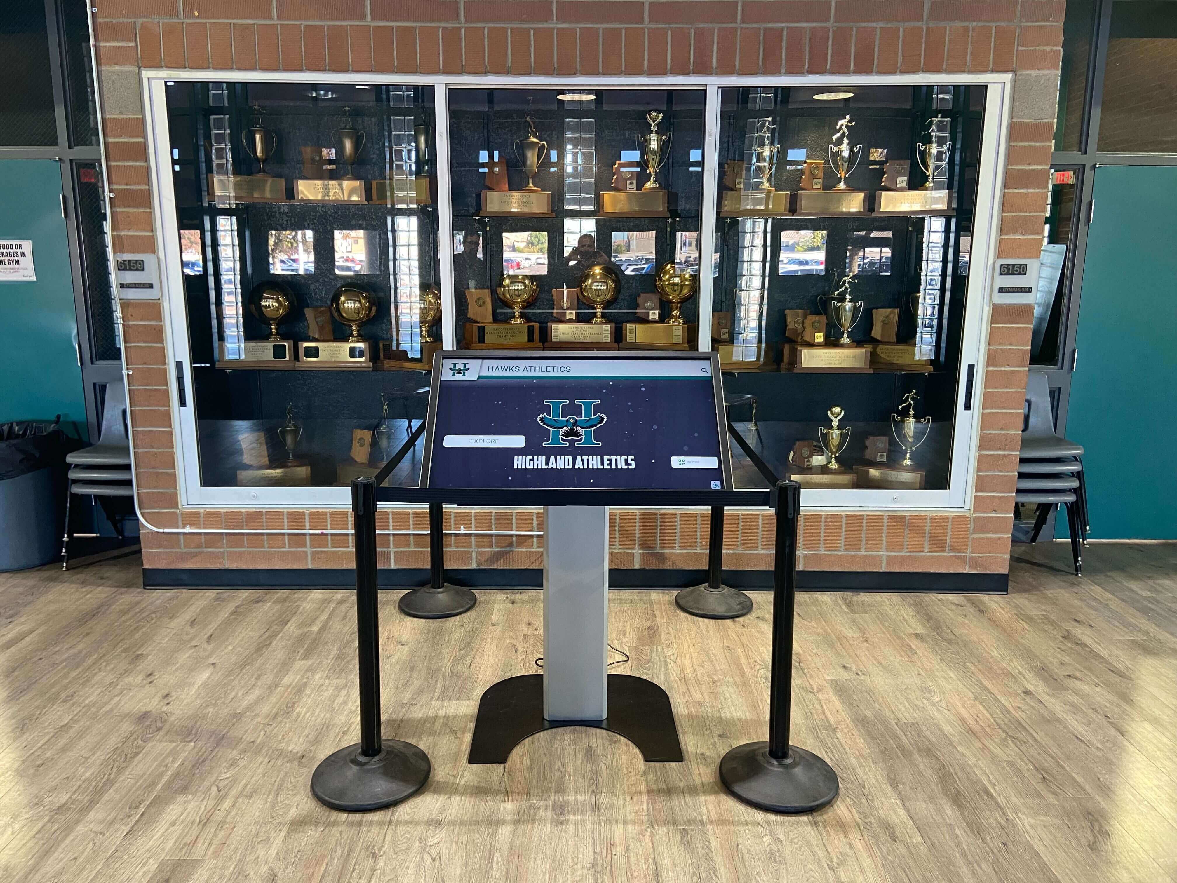
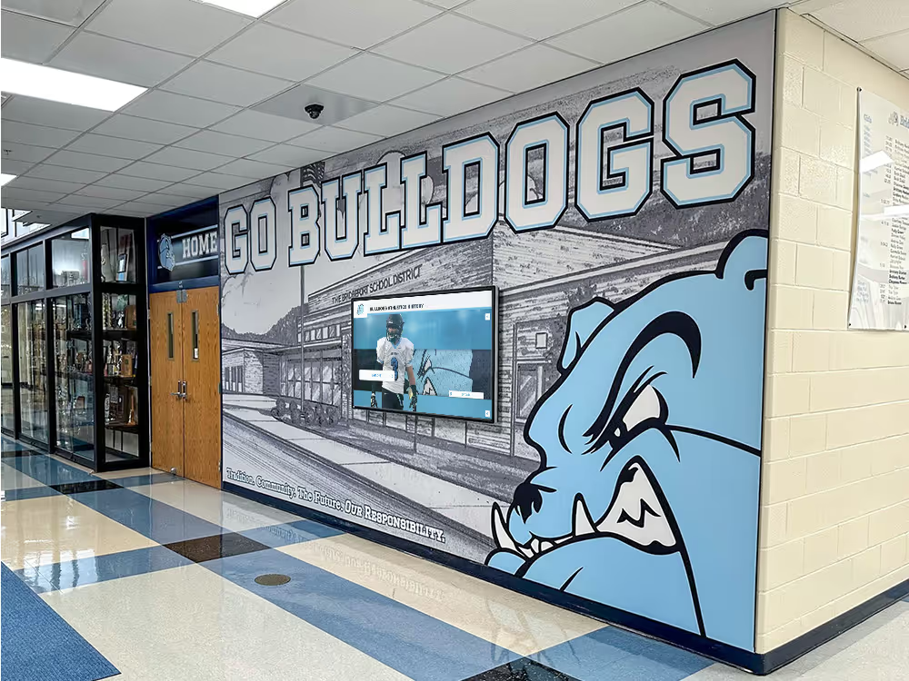
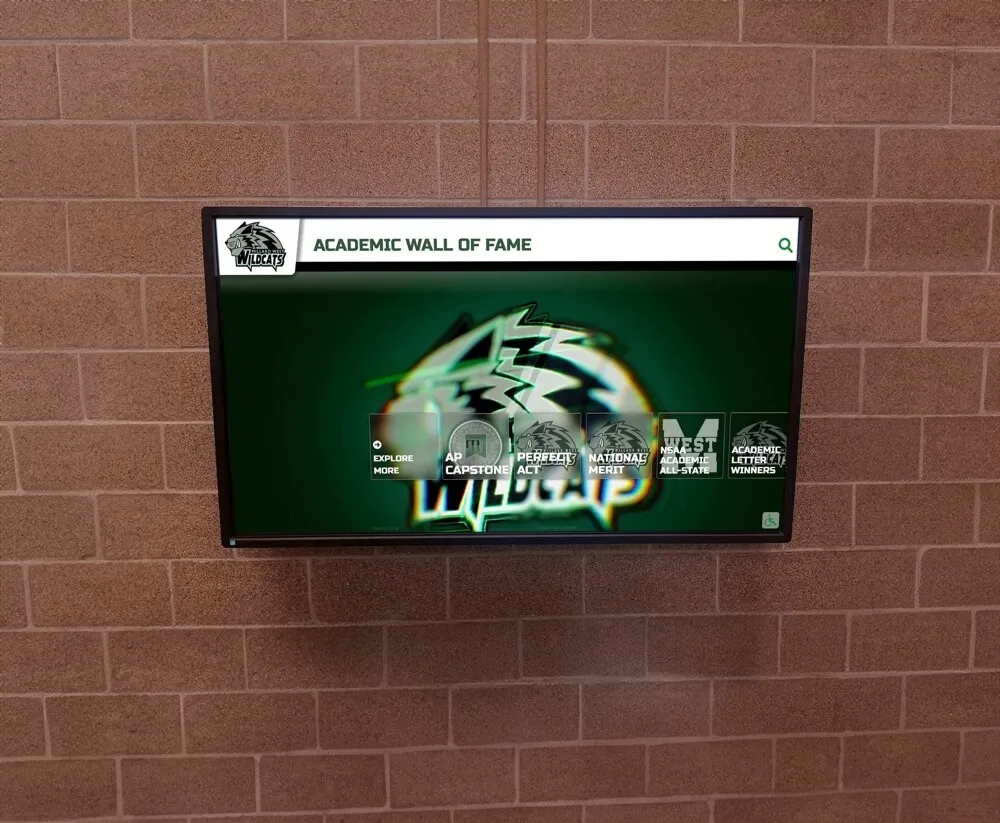
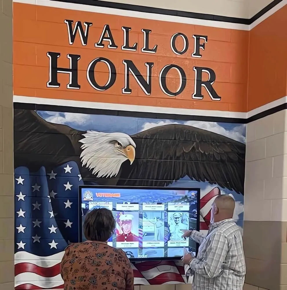
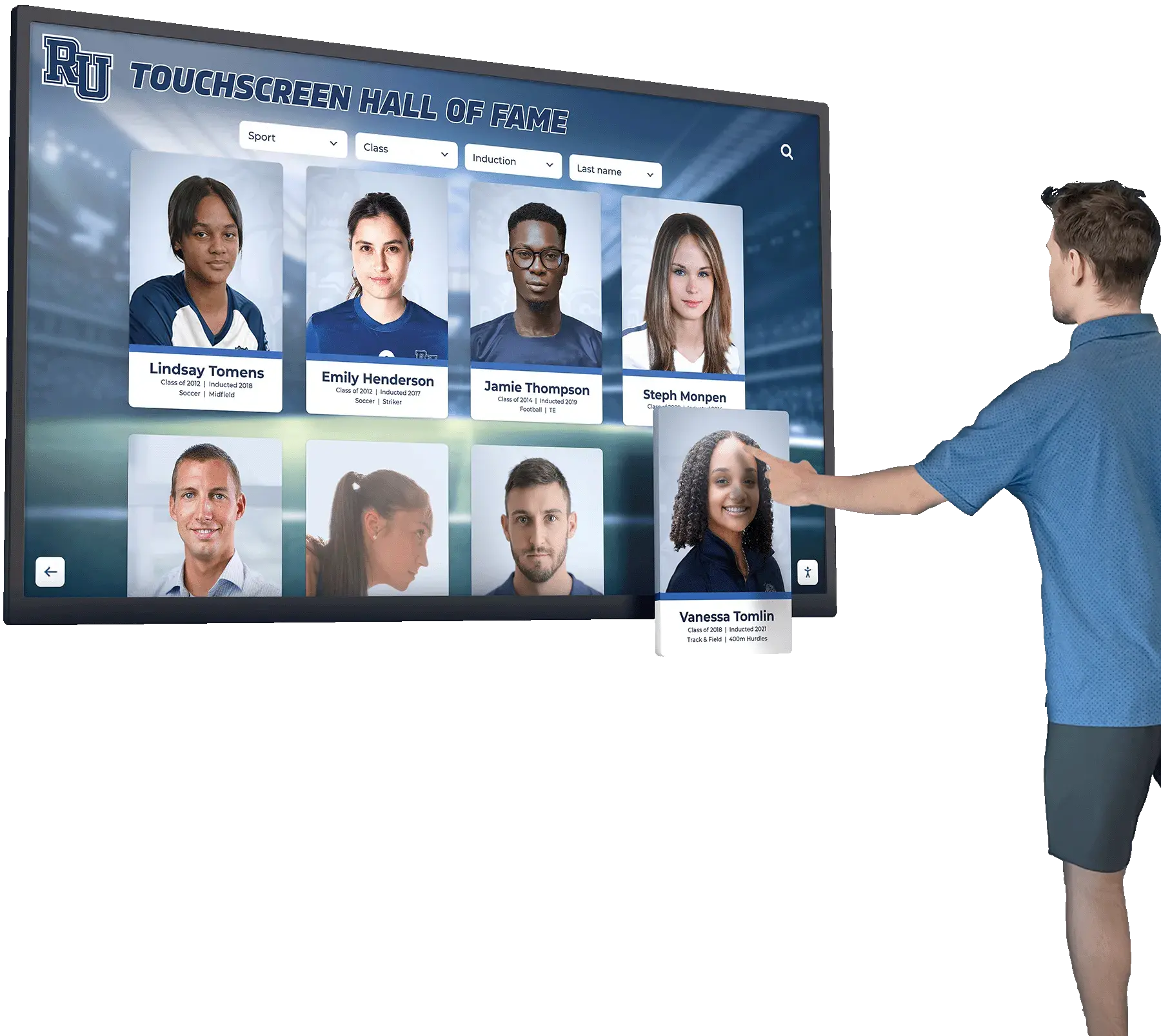
Touchscreen displays installed in school trophy cases and lobbies can house digital yearbook archives alongside current recognition content, creating year-round access to school history
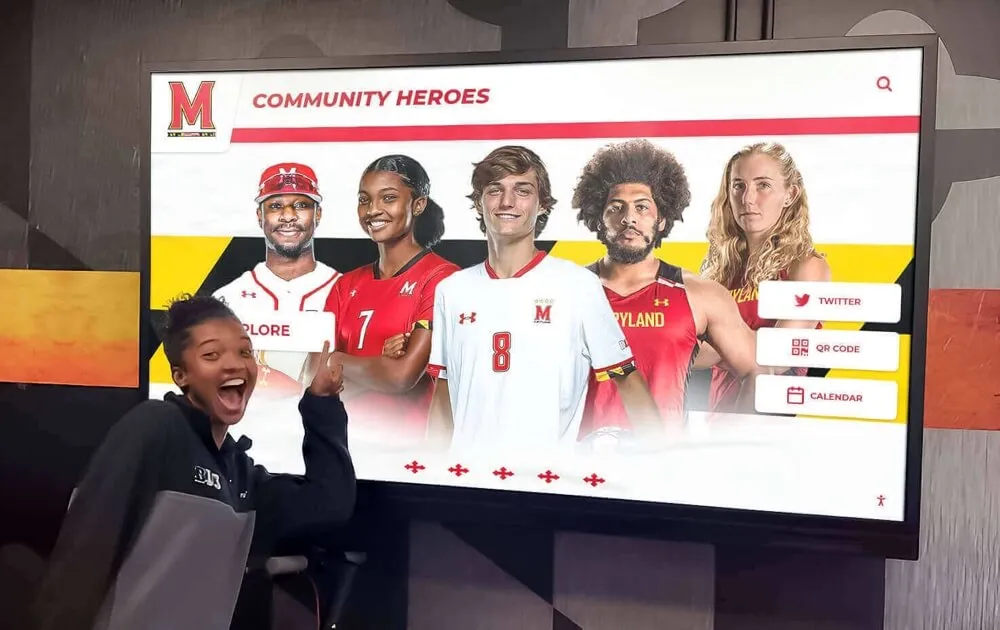
Interactive digital recognition platforms complement print yearbooks by making the recognition they contain visible and searchable year-round. When a student’s senior portrait or athletic achievement appears in a digital hall of fame display alongside their yearbook entry, the recognition becomes part of the daily environment rather than a document stored on a shelf.
Digital signage systems for schools enable institutions to rotate yearbook highlights, alumni profiles, and historical content through lobby displays, creating continuous connection between current students and school heritage. This is digital warming at work: the yearbook’s documented history surfaces continuously, keeping graduates connected and reminding current students that their moments will be preserved in the same tradition.
Rocket Alumni Solutions builds platforms specifically designed for this purpose — interactive touchscreen systems that can house yearbook archives, alumni recognition, and current student achievements in a single accessible interface. Schools using Rocket Alumni Solutions find that the content their yearbook editors worked hard to produce gets renewed visibility through digital display rather than fading when print copies age.
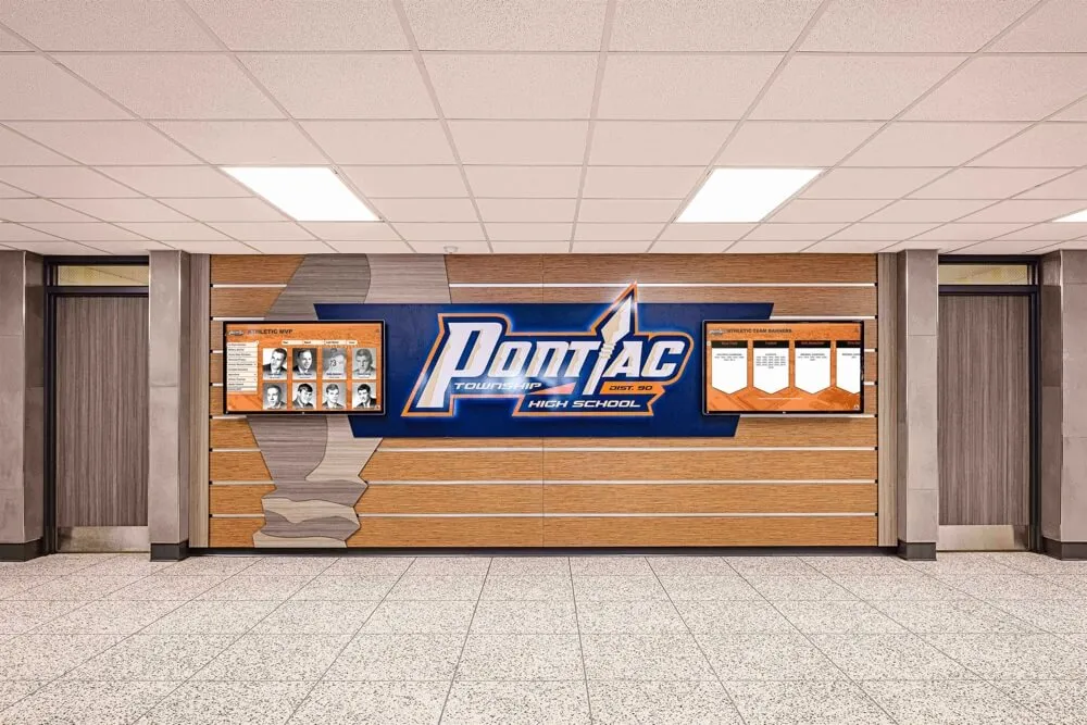
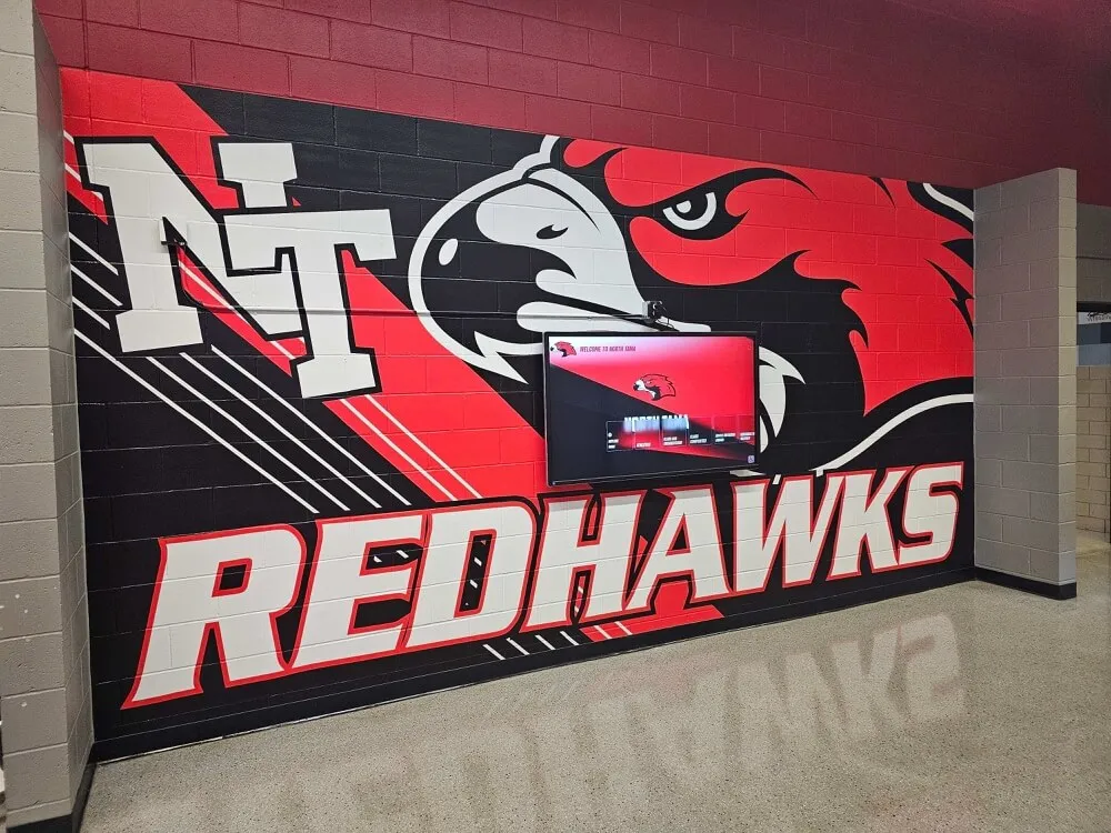
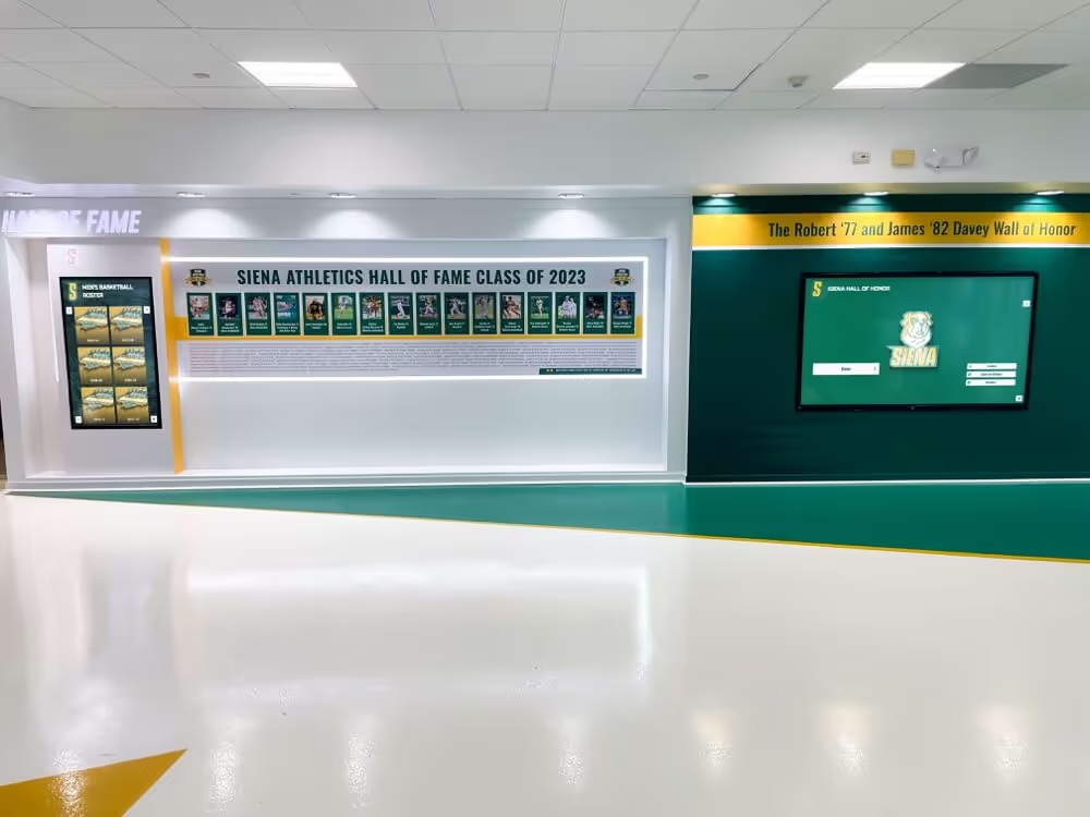
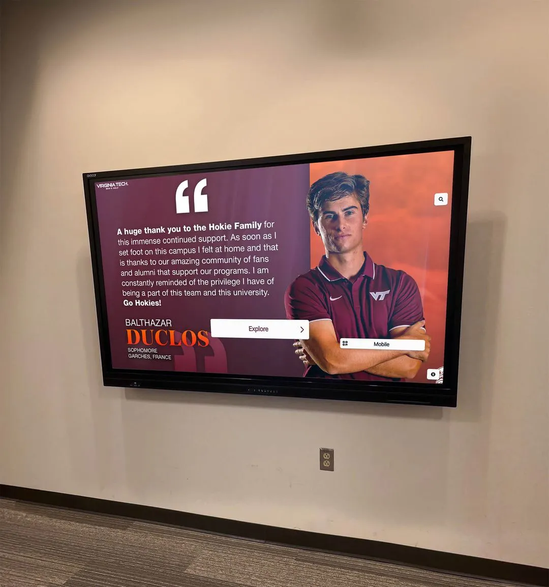
Hallway honor walls and digital archives extend yearbook content into year-round recognition — the students documented in each annual publication become part of a permanent, visible school history
Frequently Asked Questions About Yearbook Page Layouts
How many photos should appear on a typical yearbook spread? It depends on section and template type. A feature spread might use 1 dominant photo plus 3–4 supporting images. A student life mosaic spread might run 6–9 photos. Portrait pages use 4 or 6 per page depending on portrait sizing. There’s no universal right answer, but there is a universal principle: every photo on a spread should earn its place. If an image is filler, cut it.
What’s the best column grid for a beginner yearbook staff? Start with a six-column grid. It provides enough flexibility for varied layouts while giving editors clear structural anchors. Combine columns in pairs or triads to create different image and text widths. The six-column grid handles portrait grids, action spreads, and text-heavy academic sections without requiring a different structural system for each.
How do you prevent yearbook sections from looking inconsistent when different editors design them? A shared style guide is the primary solution: documented fonts, color values, photo treatment standards, and caption formats applied across all sections. Beyond documentation, review sessions where section editors share work-in-progress spreads help catch inconsistencies before pages are finalized.
Should yearbook page layouts match the cover design? Cover design elements — theme typography, color palette, and graphic motifs — should inform interior section openers and connecting spread elements. They don’t need to appear on every page, but threads that tie the cover to the book’s interior create cohesion that elevates the whole publication.
How do yearbook page layouts differ between online and print yearbooks? Print layouts are fixed to specific page dimensions and column counts governed by print production requirements. Digital yearbook layouts can be more fluid — scrolling formats, expandable image galleries, embedded video, and interactive elements are available. However, strong visual hierarchy, consistent typography, and dominant image principles apply equally in both formats.
What’s the most common layout mistake yearbook editors make? Treating every photo as equal priority. When a spread uses 8 photos at identical sizes with no dominant image, the layout reads as undifferentiated regardless of how well-composed each individual photo is. Establishing a clear visual hierarchy — one image larger than all others — is the single most impactful layout improvement most yearbook staffs can make.
Designing Yearbooks That Earn Their Shelf Space
The best yearbooks earn a place on the shelf not just because they document a year, but because they document it well — with visual clarity, intentional hierarchy, and layouts that make complex content feel organized and worth exploring.
Template-driven design is how student editors achieve that consistency at scale. A six-column master grid, section-specific layout templates that respect the personality of each section’s content, a shared style guide preventing the fragmentation that comes from parallel production, and strategic breaks from templates for genuinely exceptional moments — these principles produce yearbooks that graduate from documentation to design.
When those yearbooks then become part of a digital archive accessible to alumni, parents, and current students through interactive displays, the layouts your staff carefully designed get continued visibility that honors the work they put into every spread. The students recognized in those pages stay recognized. The school’s story stays visible. That continuity is what transforms a yearbook from an annual publication into a permanent thread connecting each graduating class to everything that came before and after them.
Discover How Rocket Alumni Solutions Brings Yearbook Content to Life Digitally